
Cee
Year: 2026
Skills: Information Architecture, User Research, Journey Mapping, Wireframing, Prototyping, Design Systems, Accessibility, Responsive Design
Tools: Figma, Xcode, Cursor, Illustrator, Notion
App Store Link / App Website
Year: 2026
Skills: Information Architecture, User Research, Journey Mapping, Wireframing, Prototyping, Design Systems, Accessibility, Responsive Design
Tools: Figma, Xcode, Cursor, Illustrator, Notion
App Store Link / App Website
Cee is live on the App Store. The website is seethecolour.com.
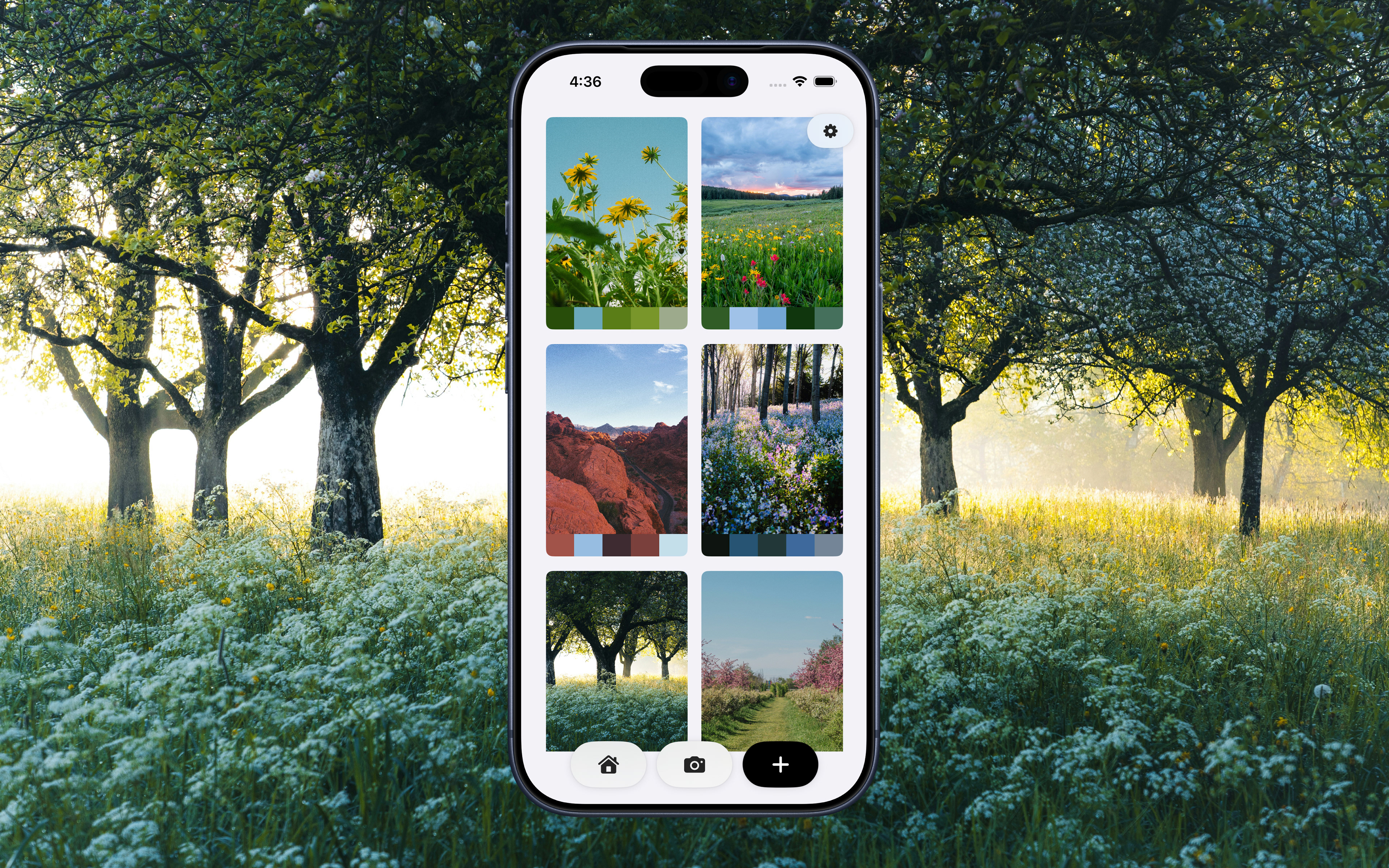
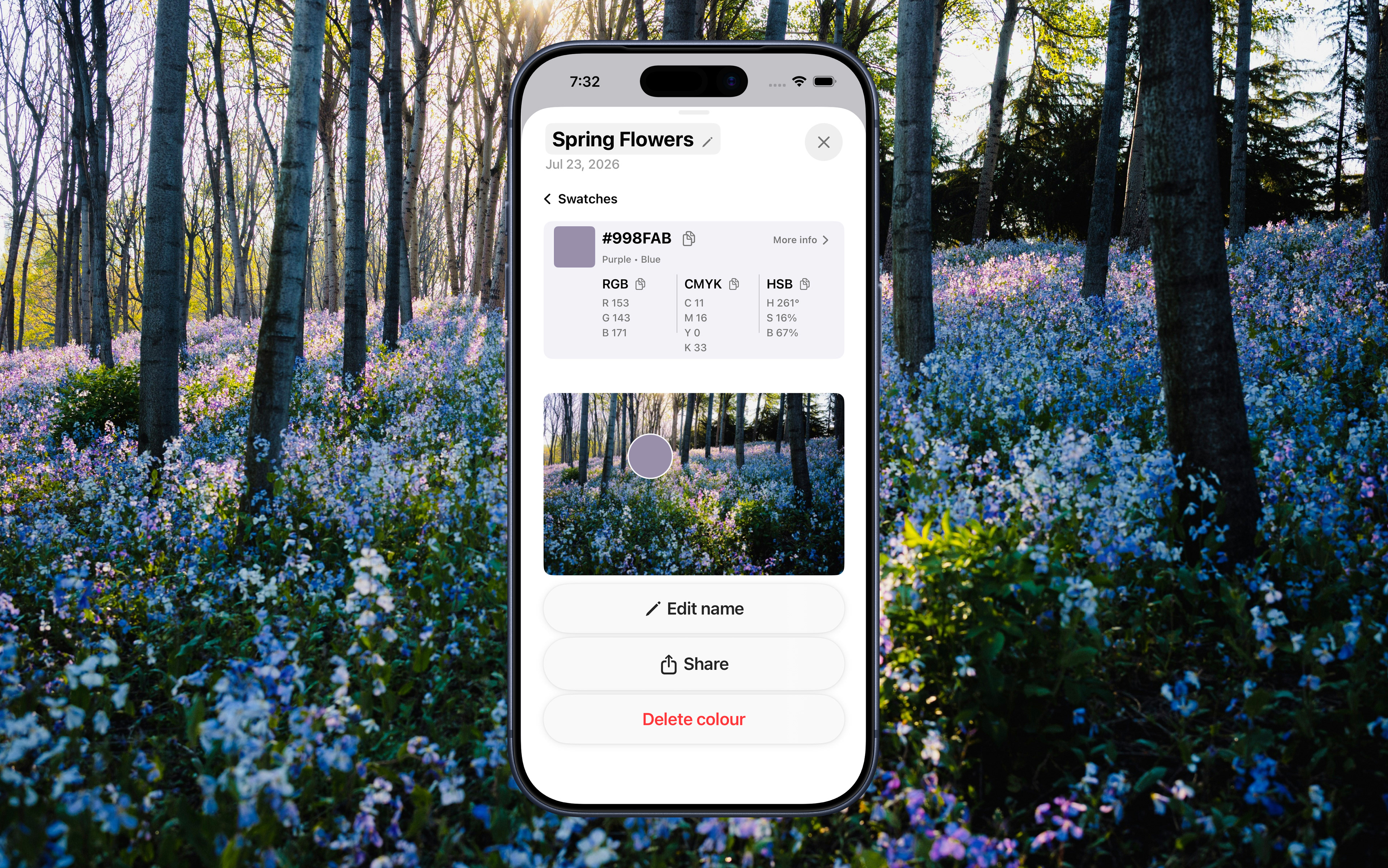
Cee is an iOS colour extraction app that turns any photo into a usable colour palette. Point your camera, take a shot, or import a photo from your library. ColourSense™ pulls dominant colours and delivers HEX, RGB, CMYK, HSB, CSS, SwiftUI, and UIKit values ready to copy and use anywhere. It’s available on the App Store with a free tier and a paid subscription, Cee More, for unlimited scans and the Live Camera Picker.
The Problem
Creatives constantly encounter colours in the real world: on a wall, in a piece of fabric, in a photo a friend sends, or in a screenshot saved months ago, and have no fast way to turn “I love that colour” into something they can use. You see it, you want it, and then you’re either eyeballing it in Photoshop or stumbling through a colour picker app that takes six taps to get a hex code.
Existing tools are either overly technical, buried in larger apps, or too slow to keep the moment alive. Inspiration doesn’t wait for a high-friction UI. The person I was designing for was someone like me: a designer or creative who works with colour regularly and just wants the code, fast, without friction.
The Approach
The core of the app had to be fast and obvious. Camera or import, extract, get the codes. Three steps that feel like one and form the throughline for everything that followed.
From there, the decisions layered on naturally. The results needed to show colours visually first, with scrollable, tappable swatches and the technical detail one level deeper. The information is always there, just not in the way you need it until you need it.
Saving made more sense as a library feature rather than a history. A library feels intentional and curated, not just a log of actions. Every saved palette lives alongside its source photo, so the context is never lost.
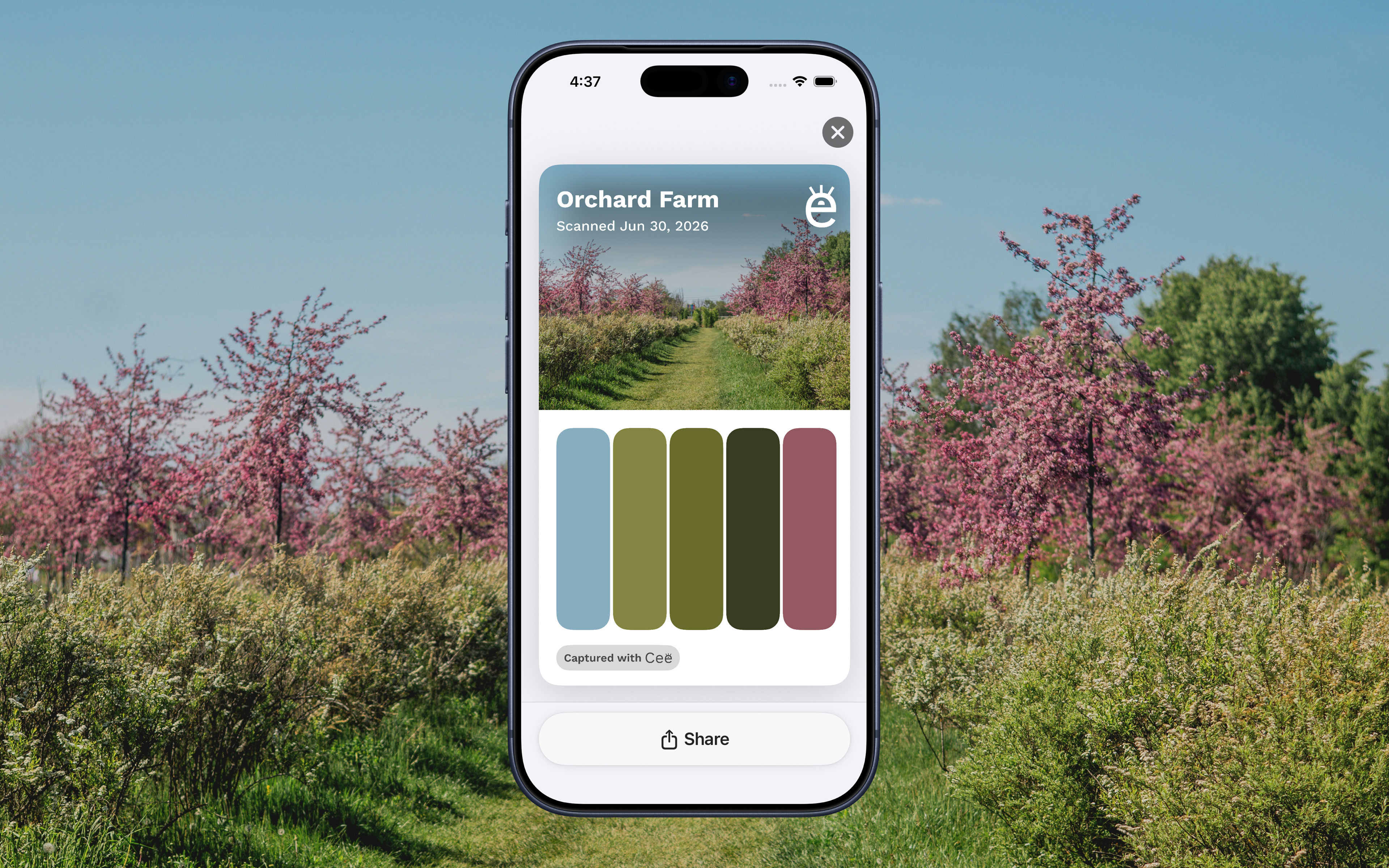
Sharing was built in from the start because it fit the workflow: you find a colour and want to send it to someone. The share card packages your photo and swatches into one clean image so there’s no fumbling trying to screenshot and crop things together.
Design Process
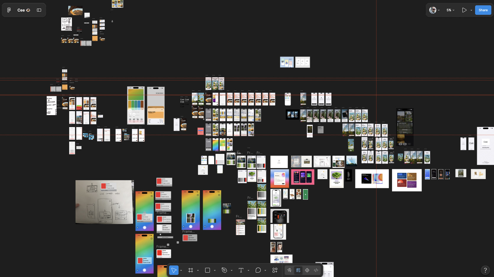
I started in Cursor and Xcode, building the functioning app alongside the Figma designs rather than finishing one before starting the other. This meant every design decision was grounded in what was actually buildable. If something looked good on canvas but caused problems in code, it didn’t make the cut.
The UI went through several rounds, starting with the home screen and library and working outward from there. The goal throughout was to make the app feel made for creatives, considered and visual, not just functional. Every screen had to support that same idea.
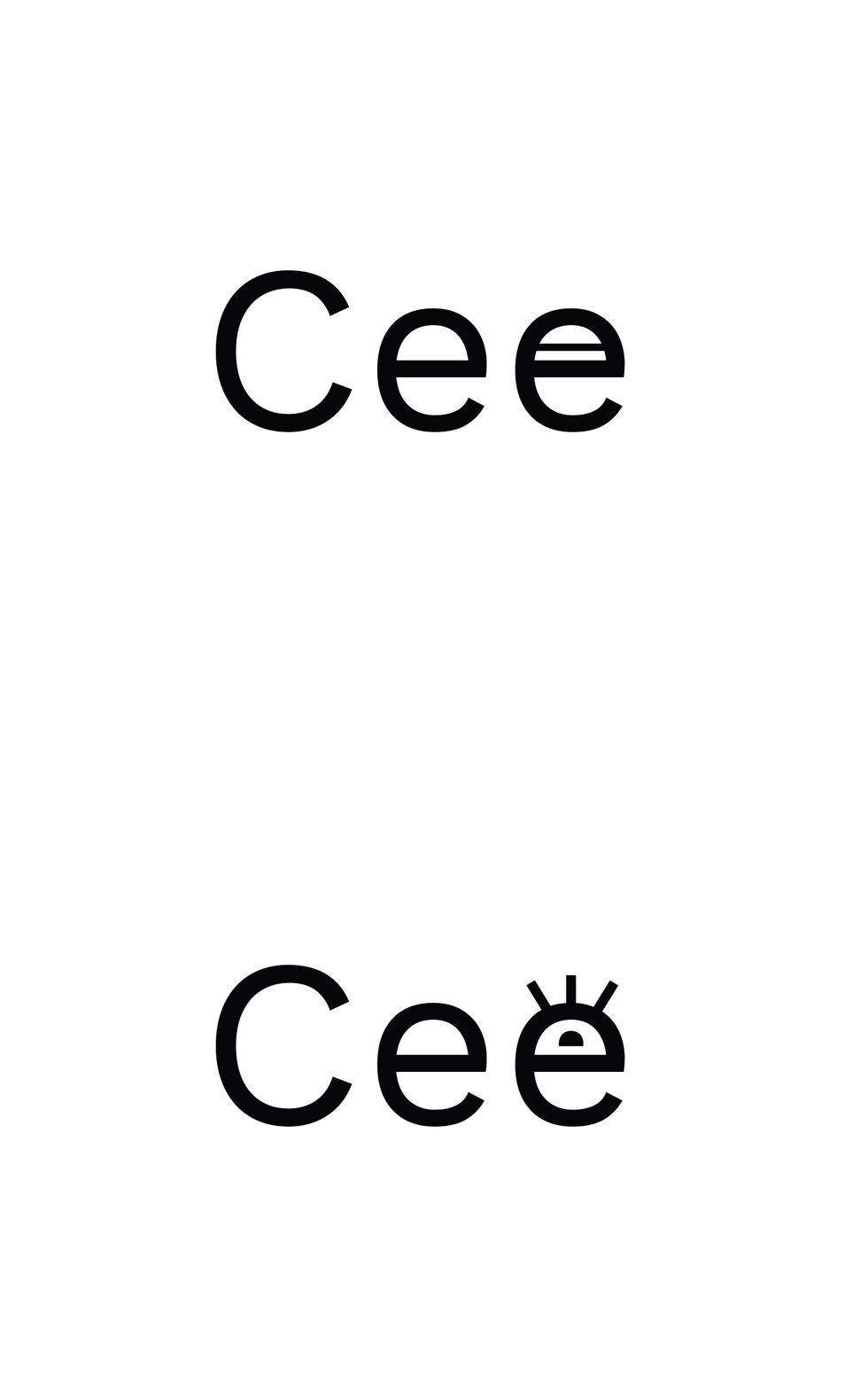
The library screen went through the biggest change. Originally, I had palettes stacked in a vertical scroll with a Rolodex-style effect, each card layered on top of the last. It looked interesting but was difficult to get right in code and kept causing problems. So I pivoted to a grid layout. Even that took iterations to get the scrolling to feel flawless and not cut off at the edges.The home screen landed on a dark background with a full-bleed landscape photo after several versions appeared too much like a utility app. The Cee logotype with the modified e came from wanting the wordmark to carry a visual identity beyond the typeface choice, so the brand felt tied to the experience.
Technical Decisions
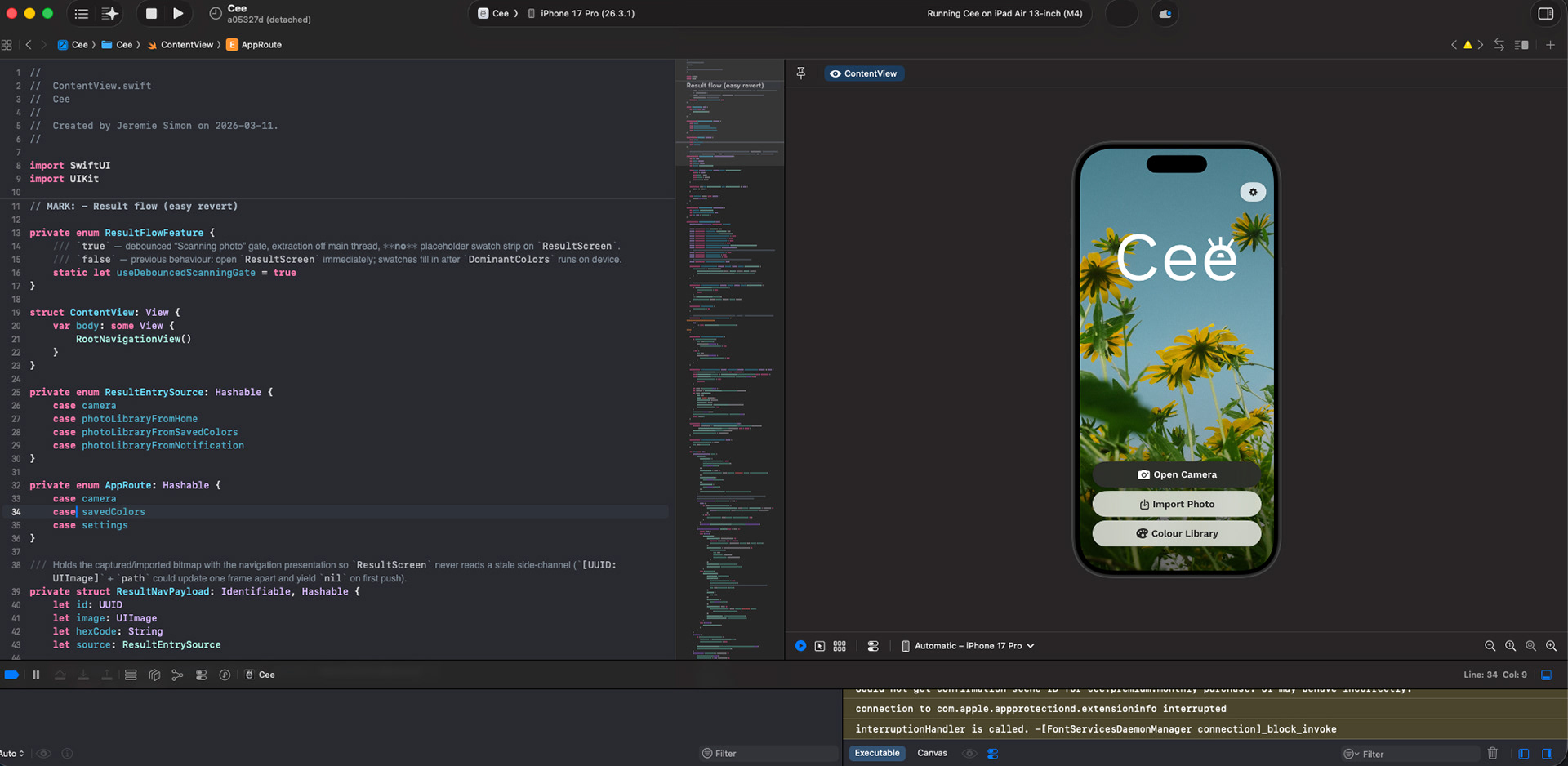
The app is built in SwiftUI with Cursor AI as the primary coding tool. I’m a designer who codes, not a developer, and Cursor made it possible to build something at this level of completeness. What it didn’t do was make the decisions. Every architectural choice, every UX decision, and every round of fine-tuning when something didn’t feel right was still me. One of the bigger outcomes of this process was learning how to use the Figma MCP extension in Cursor to implement designs directly from Figma into code, getting much closer to a true one-to-one translation between the two.
The DominantColors package handles the colour extraction, chosen after testing a few options for accuracy and performance, further fine-tuned the filtering to prioritize vibrant accents and guarantee high-contrast text readability. StoreKit manages the subscription. The scan limit runs on a rolling 24-hour timer rather than a calendar reset. This small detail is fairer to the user and prevents people from bypassing the limit by adjusting their device date settings.
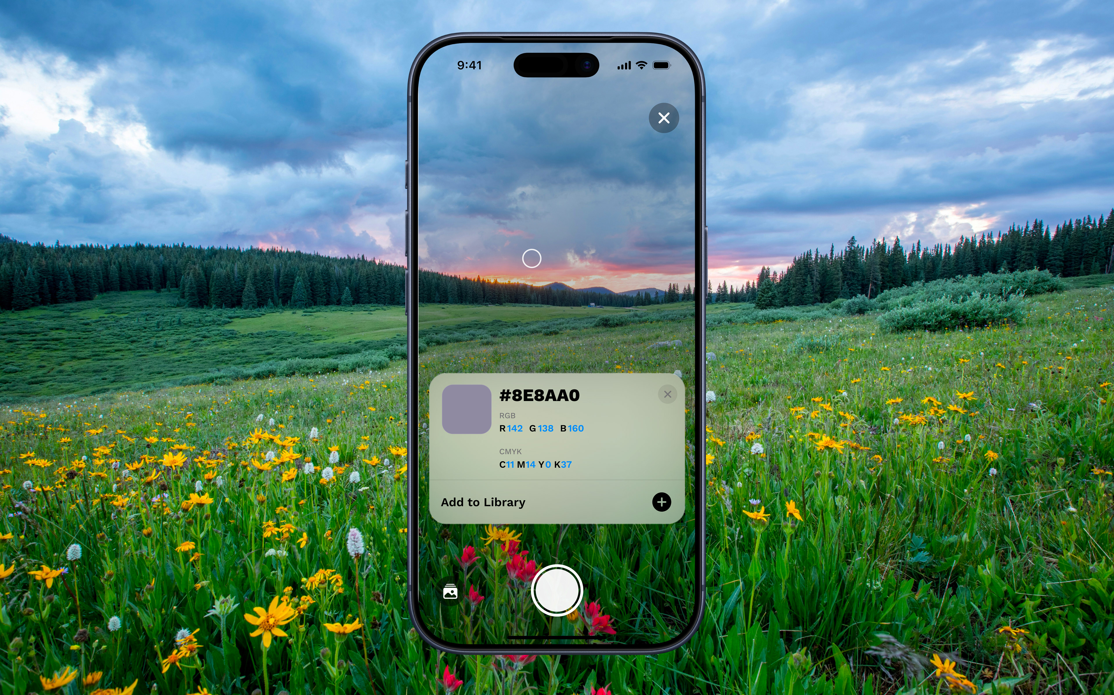
The Live Camera Picker came together towards the end of the build. I wanted it to feel intentional rather than bolted on. The preview layout was designed to emulate how colour information already looked in the Colour Library, so even though it was a new feature, it came across as part of the same system.
Challenges
The biggest ongoing challenge was the gap between Figma and SwiftUI. Design decisions that look clean in Figma don’t always survive contact with SwiftUI’s layout system. I got about 70-80% fidelity on first pass for most screens. The rest was iteration: going back to Figma, adjusting, rebuilding. One thing that helped was providing Cursor with CSS layout values alongside SwiftUI variables, which occasionally produced better design match results than SwiftUI alone.
Colour extraction accuracy took longer to get right than expected. Early on, the algorithm picked too many similar colours, missed obvious ones, or occasionally detected colours that weren’t really there. After initial testing with friends, I added the ability to tap anywhere on the photo to surface a colour, not just the preselected swatch areas. That, combined with ongoing fine-tuning of what the algorithm prioritizes, got the results to a point that felt accurate and useful.
Designing the paywall was something I thought about more than expected. A paywall wasn’t part of the original plan; it came into play as I weighed the real costs of releasing and maintaining an iOS app. The line between what seems fair and what feels manipulative is thin. Keeping the free tier genuinely useful has always been the priority. Real codes, real library, real sharing. Cee More had to feel like a genuine upgrade, not a gate.
Outcome
Cee is live on the App Store. The website is seethecolour.com.
Building this changed how I think about designing digitally. Taking on the role of both designer and developer, even with assistance, changed how I approach the relationship between the two. Understanding technical constraints firsthand and learning to translate design decisions from Figma into code seamlessly are skills I will carry into every project going forward.
If I were to build Cee again, I would lock in the design system before touching Xcode. Starting in code meant moving fast early but created rework later that a more considered design foundation would have avoided. The backwards workflow taught me that lesson better than any process doc could have.